 |
|
|||||||||||||||||||||||||||||||
|
|
||||||||||||||||||||||||||||||||
|
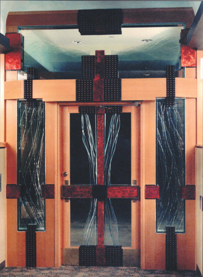
In Amy Chamberlain's words, "The library entry was designed as an architectural glass sculpture. The primary design feature in this project was the use of "negative space", or the voids, within the windows and door. I used multiple layers of cut glass to create linear movement through the entry design, unifying each of the separate window components into an integrated piece. Within the door, a central column of glass rises vertically, extending into two massive blocks of glass in the overhead transom window."
|
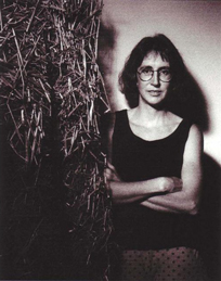
 Amy Chamberlain
|
